The Role Colors Play in Interior Design
A properly selected color can be relaxing or on the contrary – energizing. One will give the impression of cosiness, another can make the room optically bigger. Do you know how to decorate your interior based on aesthetics as much as it’s purpose?
Choosing paint for your walls seems easy enough – point to your favorite shade in the color picker, buy a can, and paint the walls. In goes the furniture and done! At a closer look, however, the whole thing is not that simple. Not only must the room look nice, it should also respond to your needs and moods. And colors play a major role in this puzzle.
3 Principles of Color Selection
Color has power! To a large extent, it affects how you feel in a given room. Making a decision on a color change, you should consider not only the aesthetic aspect, but the practical ones as well. Here are 3 questions you must answer before choosing a dominant color:
- What’s the purpose of the room? Is it for work, spending your free time or solely for sleeping? Is it for a child, an adult or multipurpose? How many hours a day will be spent here?
- How light is it? How much sun does it get, how’s it situated regarding the directions of the world? Is it light when you use it? There’s also the matter of artificial lighting – is it central or point, warm or cold? It’ll have a say in the final color effect as well.
- How large is the room? Is it an open living space you can organize into different areas, or a small room? The size will determine not only the color but its intensity too.
Color Temperature
Before you even start choosing the color itself, think about the spaces that make you feel good. Do you prefer warm or cold shades? Remember that cold shades make rooms optically larger, while warm – smaller (they are cozy and shorten the distance). Theory aside, the effect also depends on the above-mentioned quality and quantity of light. It could so happen that a cold white color will make up for a cozy, warm impression. And vice versa.
Despite the common assumptions and divisions into cold and warm colors, everyone perceives them differently. You may call a given color beige, while for somebody it will be a shade of grey. Another person might see a pinkish hue. The same is true of how colors affect our senses – when too dark, these seemingly calming ones might be overwhelming, and the cheery ones irritating. It all depends on their intensity and how they harmonize with the room.
White Not Always So White
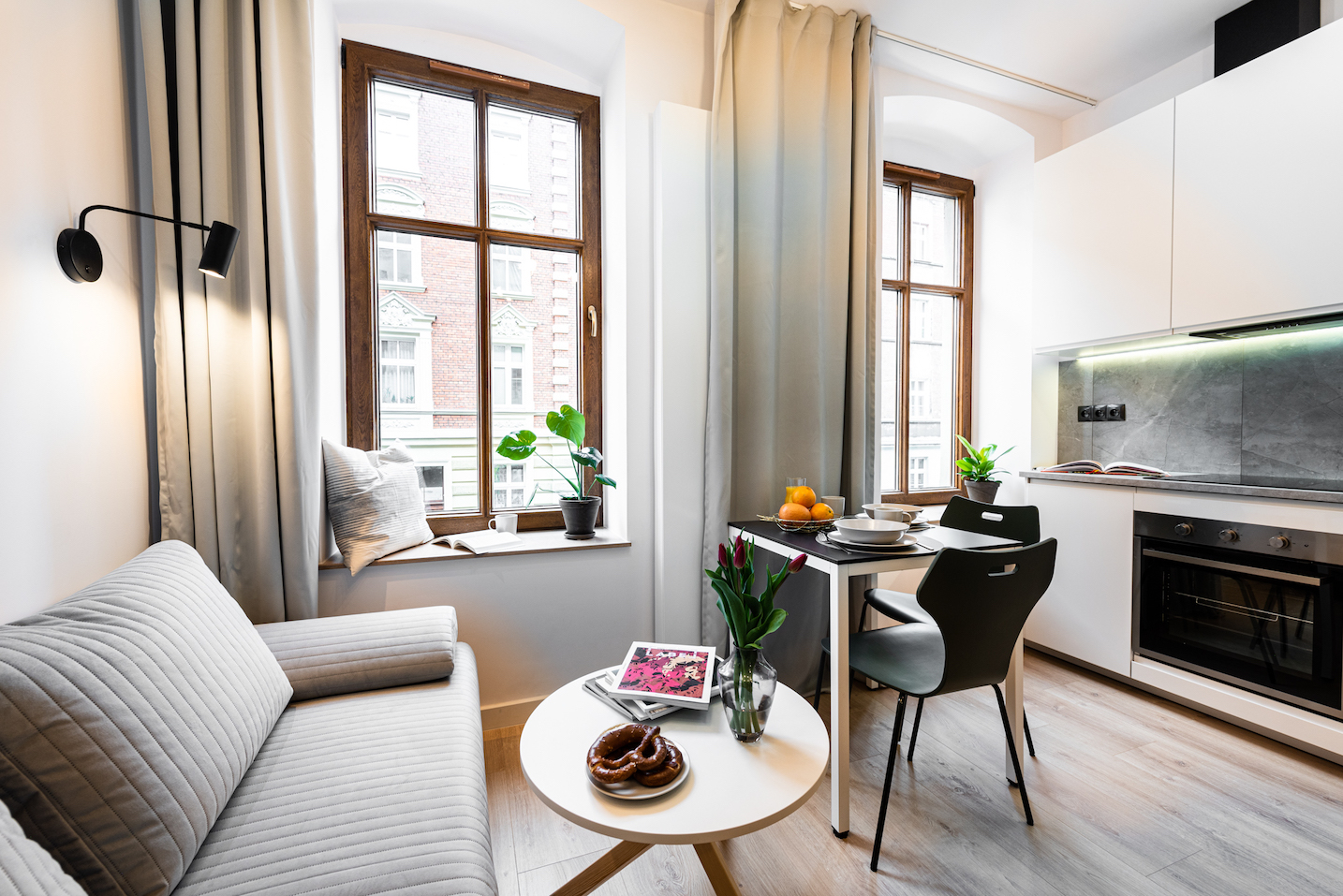
The white arrangement, starting with white walls, remains the most popular, especially in the favored Scandinavian design. It makes the apartment optically larger, brighter, and works as a base for other accent colors and accessories. But…not all that is white, is white. Whoever’s had to choose white from a color picker knows how many shades there are. On top of that, white comes in warm and cold tones, and in different finishes – glossy will be minimalistic, modern and cool, while a matt finish makes the surface classic, almost cozy.


White in interiors:
- is a universal and safe solution
- makes rooms optically larger and brighter
- makes the place fresh and clean
- is a great background for other colors and lets you arrange virtually any style
More inspirations and arrangements with white can be found in this post, where we’ve written about Minimal and Scandinavian design.
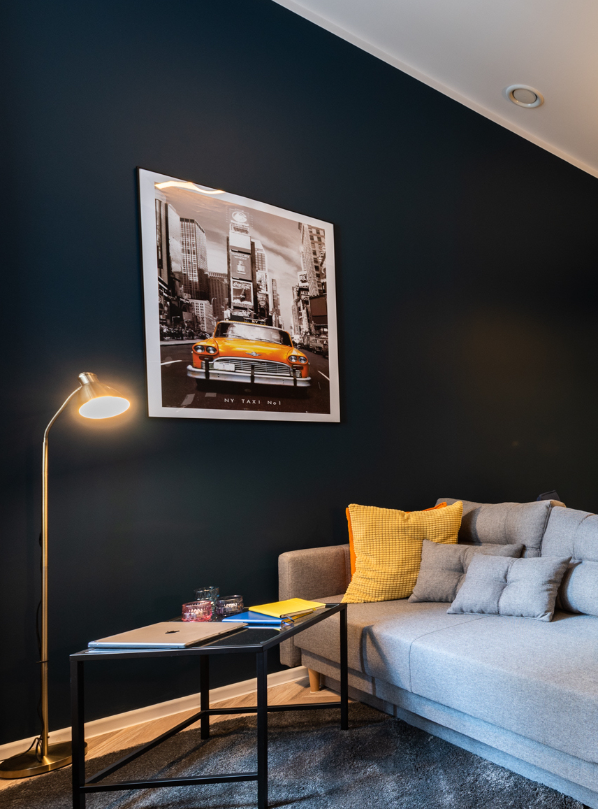
Dark Blue, Almost Black
Although very dark colors, led by black, have been gaining in popularity, they won’t work everywhere and for everybody. They work in spaces where we don’t stay long and rather not during the day. Usually applied in offices, they add prestige and elegance. However, before you decide to paint the whole room dark, test it on a small part of a wall to check how it makes you feel.
Choosing black is a bit like choosing white – it seems easy, but all the shades make your head spin. You think you’ve bought black paint, sofa or curtains, while in a given light, at a given time of day, they turn out to be almost navy blue or graphite. It’s magic indeed.

Black in interiors:
- makes a room optically smaller
- brings associations with luxury and elegance
- is a good solution for modern spaces
- matches virtually any accent color
- makes the place feels formal and mysterious
Check how we played with dark colors in this apartment.
Cozy Beiges and Browns
Beige is a safe choice for those unconvinced of the austerity of white, who like a gentle warm atmosphere. From the delicate, barely cream shades, to stronger colors, beiges are very trendy this season as well. They’re easily introduced by color on the walls or by fabrics (a sofa cover, light natural curtains or a tablecloth).
Brown, in turn, for decades was associated with wall units and wood grain panelling, has made its comeback. Although it usually fills the space as wooden furniture and floors, it becomes more bold in simple arrangements referring to the colors of the earth.
Beiges and browns in interiors:
- make a room feel cozy and warm
- are good for relaxation, giving a sense of comfort
- make for a great base for the enthusiasts of natural arrangements
- introduce a Mediterranean atmosphere

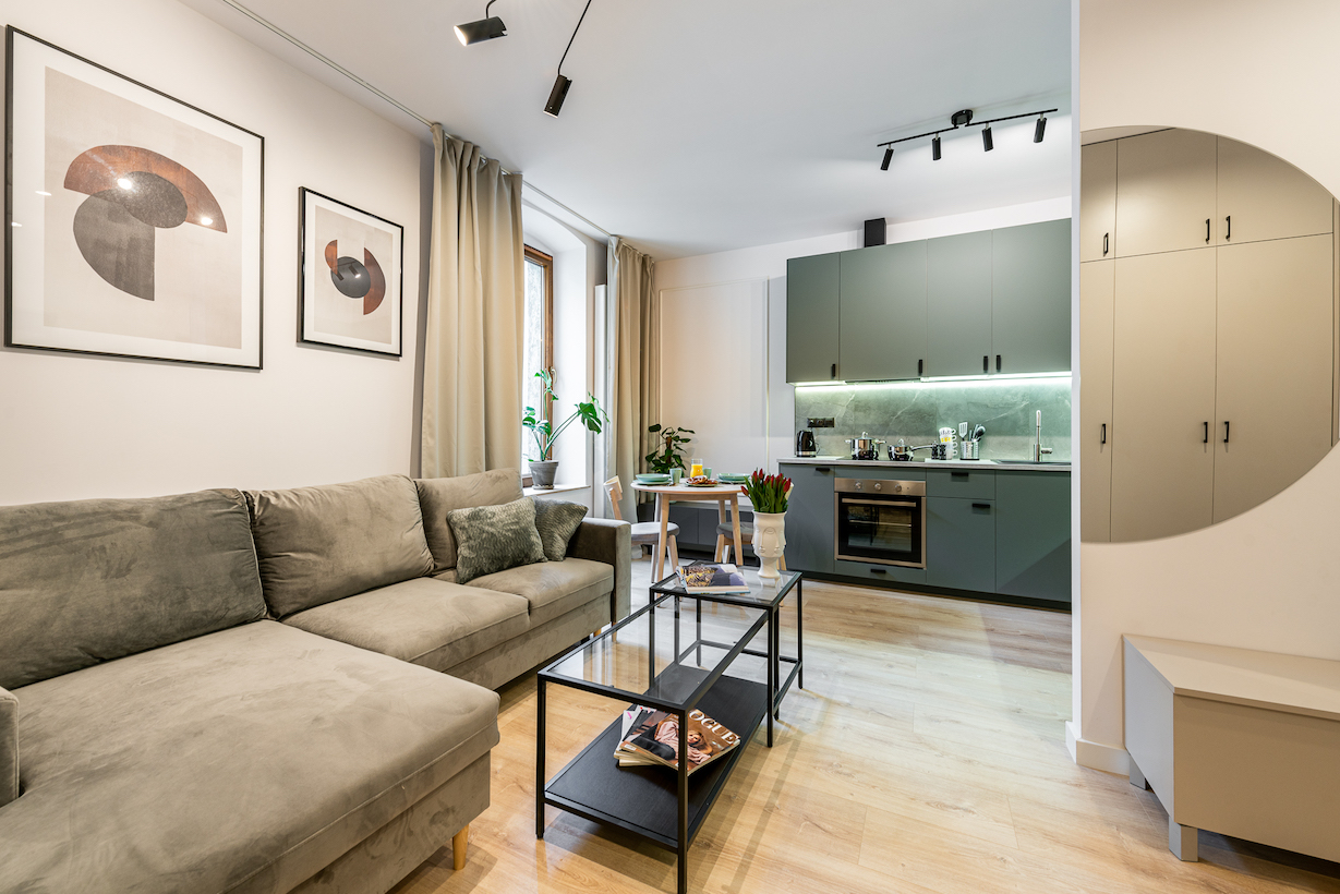
Favorite Grey
The favorite of many interior designers and architects (ours included), grey is a universal solution and a great alternative to white. In the Scandinavian style it harmonizes with shades of blue, black, and as a background for decisive, vivid accessories.
Due to the diversity of its shades, grey can be cool, almost metallic (which works in minimalistic, modern arrangements) as well as warm, falling into beige (it harmonizes with natural materials and makes a room warm rather than cool).
Grey in interiors:
- makes a room feel safe, solid, and peaceful
- is elegant and universal
- depending on the shade, can be cool or warm
- is perfect for multipurpose interiors
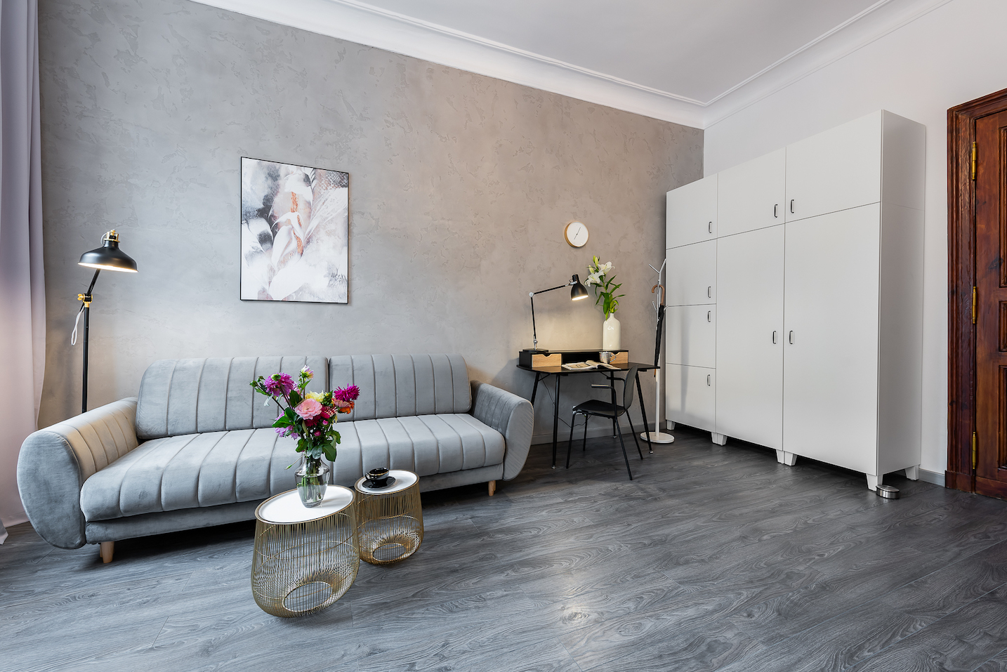
Below you can have a look at one of our apartments in which grey has taken on different shades – from natural concrete on the wall, through soft velvet, to a nearly purple hue on the curtains.
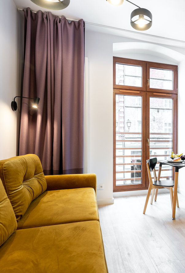
Yellow Energy
The palette from yellow, through orange, all the way to red is considered warm, with invigorating colors. The most energizing one is yellow, making a great color match with contrasting grey. Yellow invigorates browns and whites, and also brightens black. Interestingly, yellow doesn’t have to be warm – sometimes it comes closer to green.
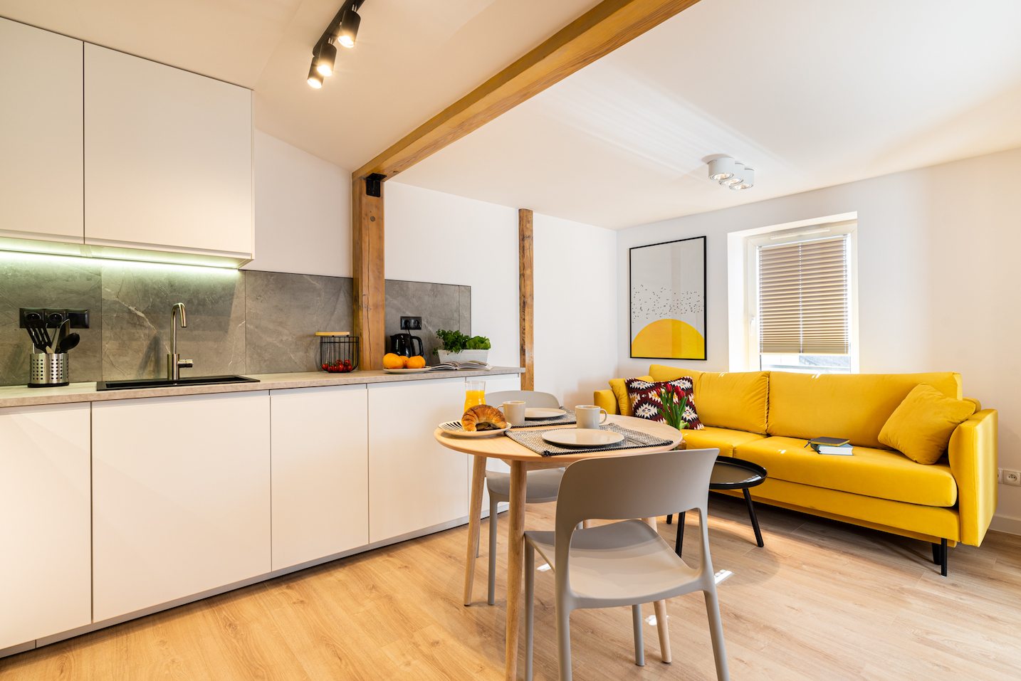
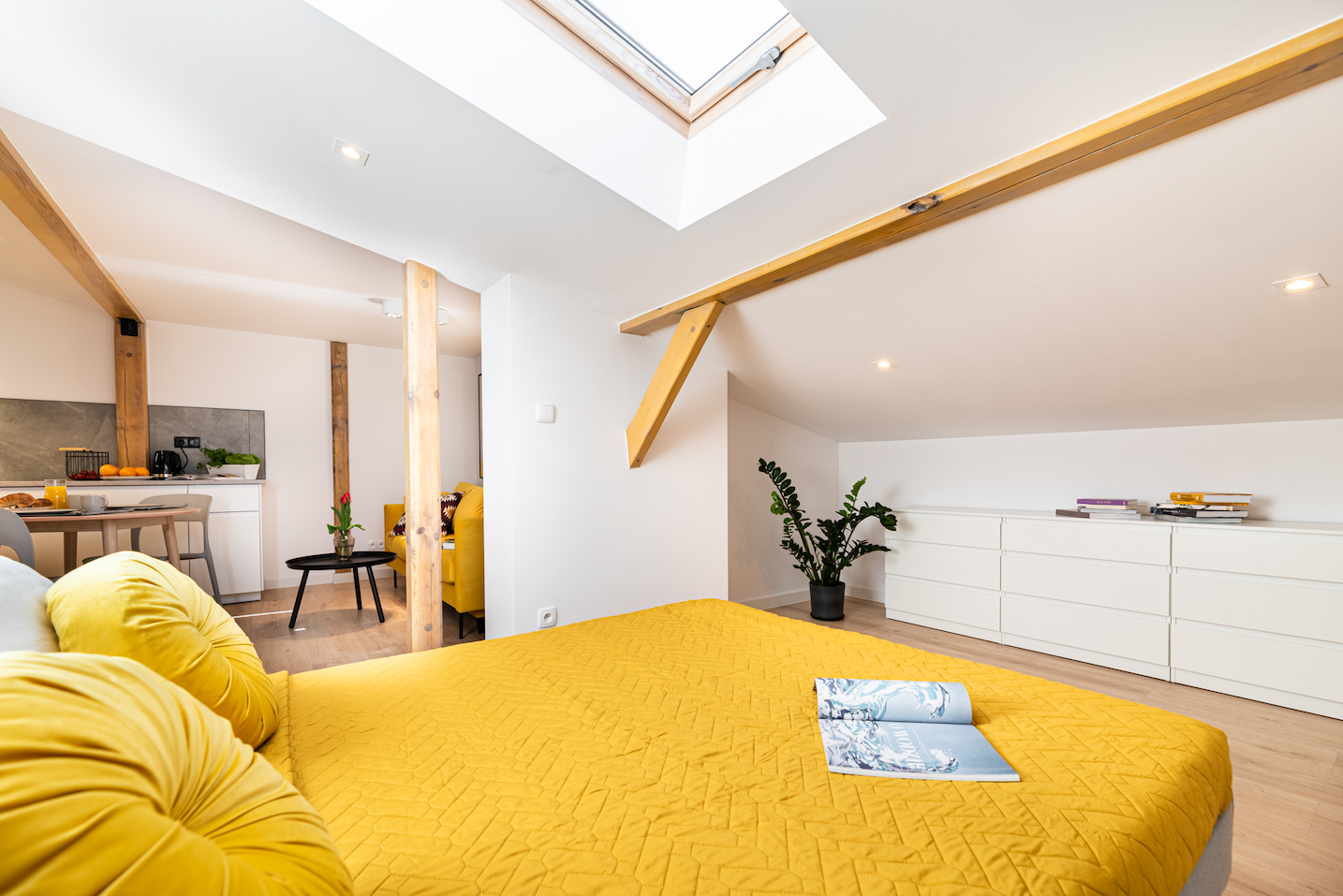
We have a soft spot for yellow and use it in our arrangements, usually in the warm, honey, and mustard shades of sofas and home textiles. In the interior, we’d recommend yellow in moderation, as a decorative element or an area divide, like in this apartment.
Yellow in interiors:
- makes a room joyful and optimistic
- brightens dark interiors
- works well in living spaces and kids’ rooms
- in perfect harmony with gold, makes for stylish arrangements
Walk In the Forest
It’s long known that walking in a green park or forest lets us take a deep breath and get a new perspective. Green – thanks to its strong association with nature – allows us to calm down and breathe more freely. It’s an optimistic yet moderate friend of yellow.
The lighter shades of green have been present in interiors, snuggling down mostly in bedrooms. In the past few years dark bottle green has found its way into living rooms and common spaces, becoming an emerald jewel in the color crown.
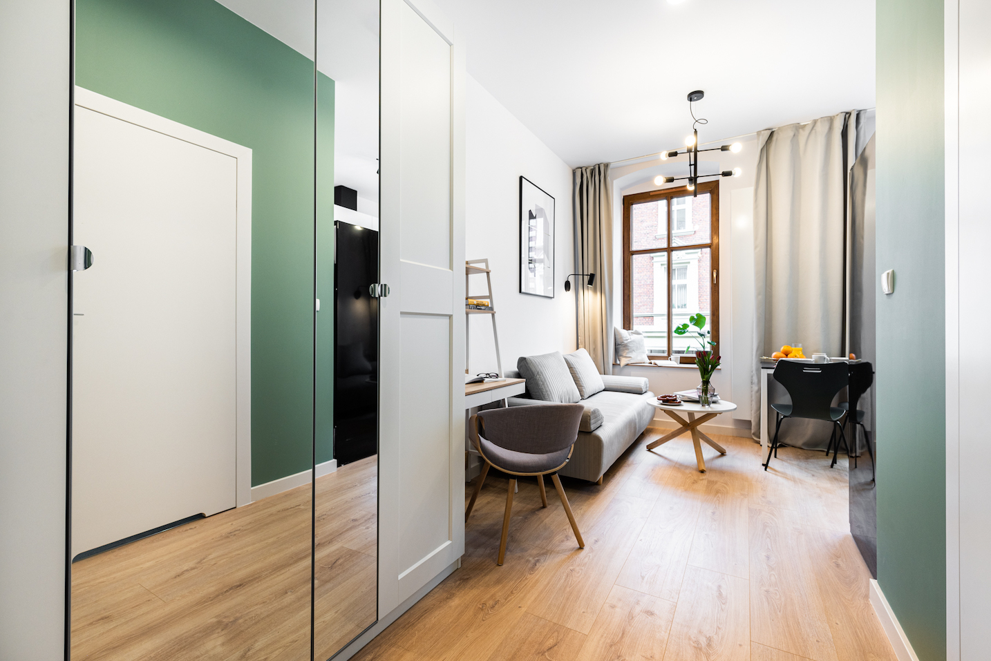
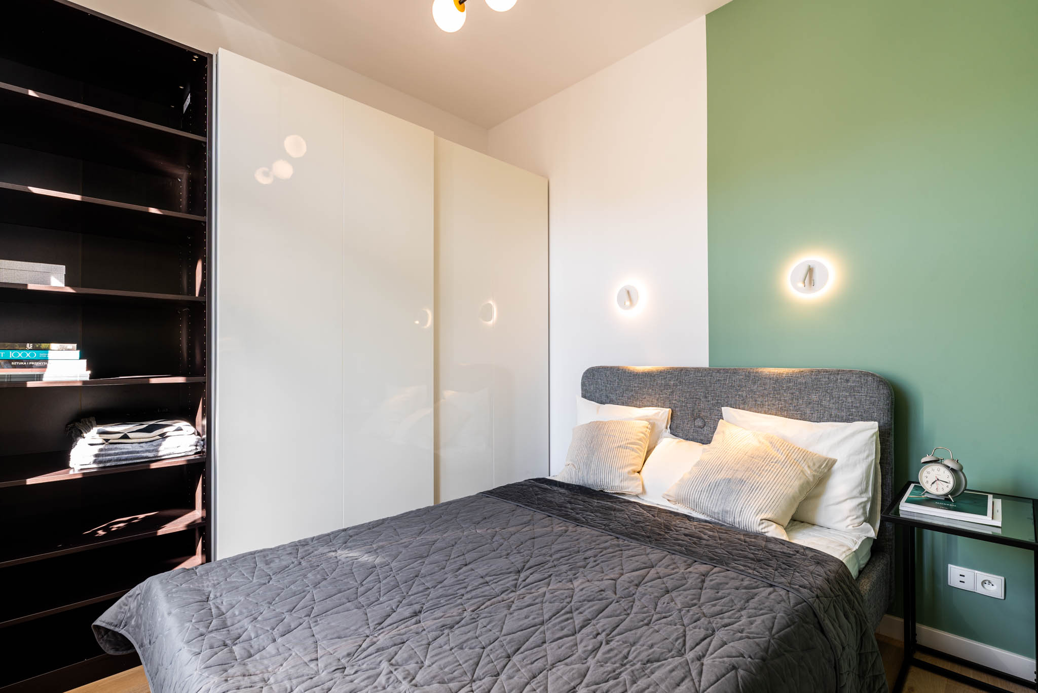
Green in interiors:
- is soothing and calming
- facilitates positive thinking
- is ideal for bedrooms, and places wherever solace is needed
- comes with choices – it can be olive warm, cheery lime, spring grass juicy or noble like precious stones
See our arrangements with various shades of green: light green or dark bottle green.
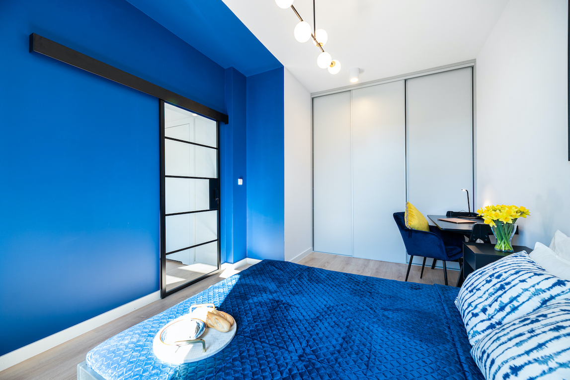
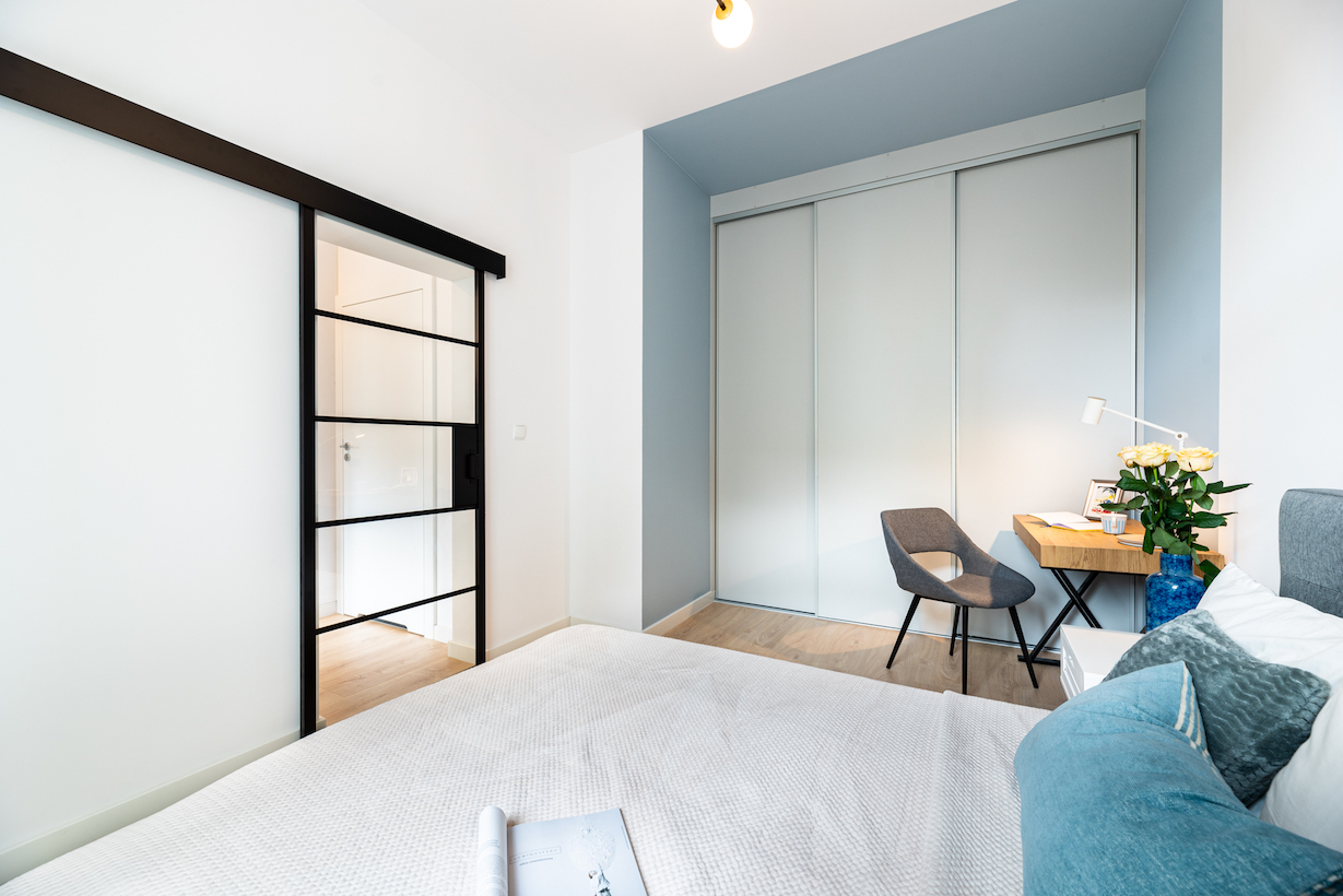
Many Shades of Blue
Azure, like green, is strongly related to nature and brings to mind a clear blue sky or calm mirror of the ocean. It’s soothing, good for meditation and focusing. It’s therefore recommended for bedrooms as well as offices, studies, and all the other places where you want to calm your thoughts.
It’s a color of the cold palette. Used on large surfaces, with little warm daylight, it could bring an unpleasant chill. For the beige and brown monothematic spaces, in turn, it’ll come as a great contrast, especially on furniture and fabrics.

Blue in interiors:
- makes a room seem cold
- facilitates concentration
- harmonizes with grey, contrasts with yellows and warm beiges
- in dark shades is associated with trust, success, and loyalty
- as a light gentle shade brings you calm and serenity
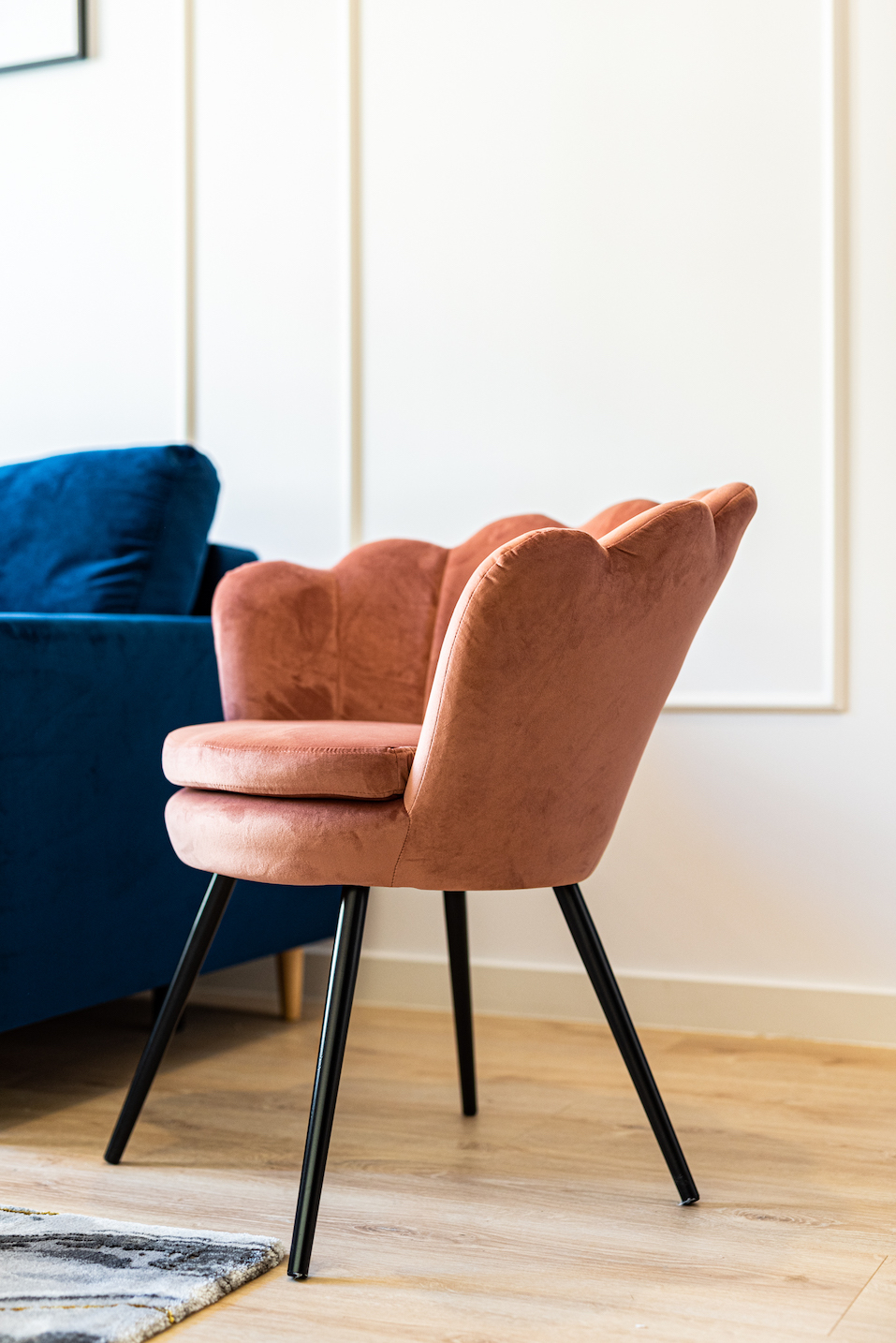
Undervalued Pink
Once associated mainly with girls’ rooms, pink used to be one of the least appreciated colors in interior design. However, carefully arranged natural shades of pink can complement even the most elegant room. It works on a sofa or an armchair as well. It’ll be an interesting accent against the background of navy blues or greys.
Pink in interiors:
- in psychology, it’s associated with softness and serenity
- harmonizes with natural colors and wood
- invigorates and brightens indistinct interiors
- is a great counterpoint to dark colors
And what about you? Which interior color you like the most?